Menu
Why Choose Us?Lifeline Vascular Access
Having worked with Lifeline Vascular Access on a previous (albeit smaller) engagement, our group nurtured an ongoing relationship with the leadership team. When it came time for a more complicated project, the fine folks at Davita felt very comfortable to award our group the opportunity to drive the Lifeline Vascular Access website redesign — from concept to completion.
We went into this project with a fair understanding of Lifeline Vascular Access’s business, but we opted to take our knowledge of the industry one step further. To accomplish this task, we scheduled a 2-day boot camp at the Lifeline headquarters in Vernon Hills, Illinois. The goal of our discovery session was to define customer needs and pinpoint why nephrologists ultimately “hire” Lifeline.
Our first major step in the website redesign process was to start with user needs. The challenge with such projects is to define true website audience types. Even harder is articulating why we even need certain functions to exist. Huddled in a small, yet comfortable boardroom, we covered the walls with notepads, post-it-notes, and white board scribbles to visually pair key stakeholder motivations with ideal website features. Through ongoing discussion (and vigorous debate) with Lifeline leadership, we condensed our findings into five accurate and detailed user personas that served as our roadmap for everything moving forward.
All of our primary research was worth the time. In truly defining various website audience types, we made a few key discoveries. Lifeline’s business model centered on physicians seeking an entrenched business management and marketing service provider to operate their private practices. In return, Lifeline would receive a healthy and well-deserved management fee. For us to effectively partner with these physicians, the website needed to show reach and demonstrate key benefits in a way that ambitious nephrologists would understand (and appreciate).
Once we framed various user scenarios, we then applied those key learnings to the content and site architecture. We restructured the website into logical and orderly pages that grouped similar content blocks into easy and accessible pathways. To enhance our new site structure, we applied our SEO expertise to uncover the best possible medical keyword phrases that would allow Lifeline to rank higher (organically) in the major search engines.

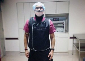
To complete the discovery process, we took it one step further and visited an actual Lifeline Vascular Access facility. Our principal, Naveed Usman, went so far as to put on scrubs to witness the kinds of procedures that these centers perform on a daily basis. This up-close and personal approach revealed the value that Lifeline brings to each of its centers.
The team at Usman Group presented themselves with a high level of integrity. Don’t look at Usman Group as a web developer; look at them as a digital strategy partner. It’s better to talk about any problem or solution so that they can use their experience and innovation to find the right answer.
VP of Marketing & Strategy
 When coming up with a concept for the design, there was one aspect of Lifeline’s business that stood out and influenced our philosophy. That was the idea that Lifeline is not just one of many companies in the healthcare management field, but one of the leading ones. This meant that we had to come up with a concept that showed a particularly high level of success and standards. The redesign also had to be completely different from their competition, while remaining best in class. We wanted the site to scream, “We are the best!” before the user even had a chance to get into the content. We approached this goal in a number of ways.
The first challenge was finding a way to showcase some impressive company statistics to feature prominently on the home page. The idea was to demonstrate capability by showing that Lifeline’s current wins. We used some friendly faces from the Lifeline team in the form of a slider, as well as some telling infographics and a video overview of the company to build further on the idea of experience and credibility, while maintaining brand standards.
The same philosophy carried over to the sub pages. With so many pages that ranged in size and content, we made sure to add in images and infographics to highlight important people and facts. This allowed us to give the pages a more interesting structure overall, which kept things fresh for the user.
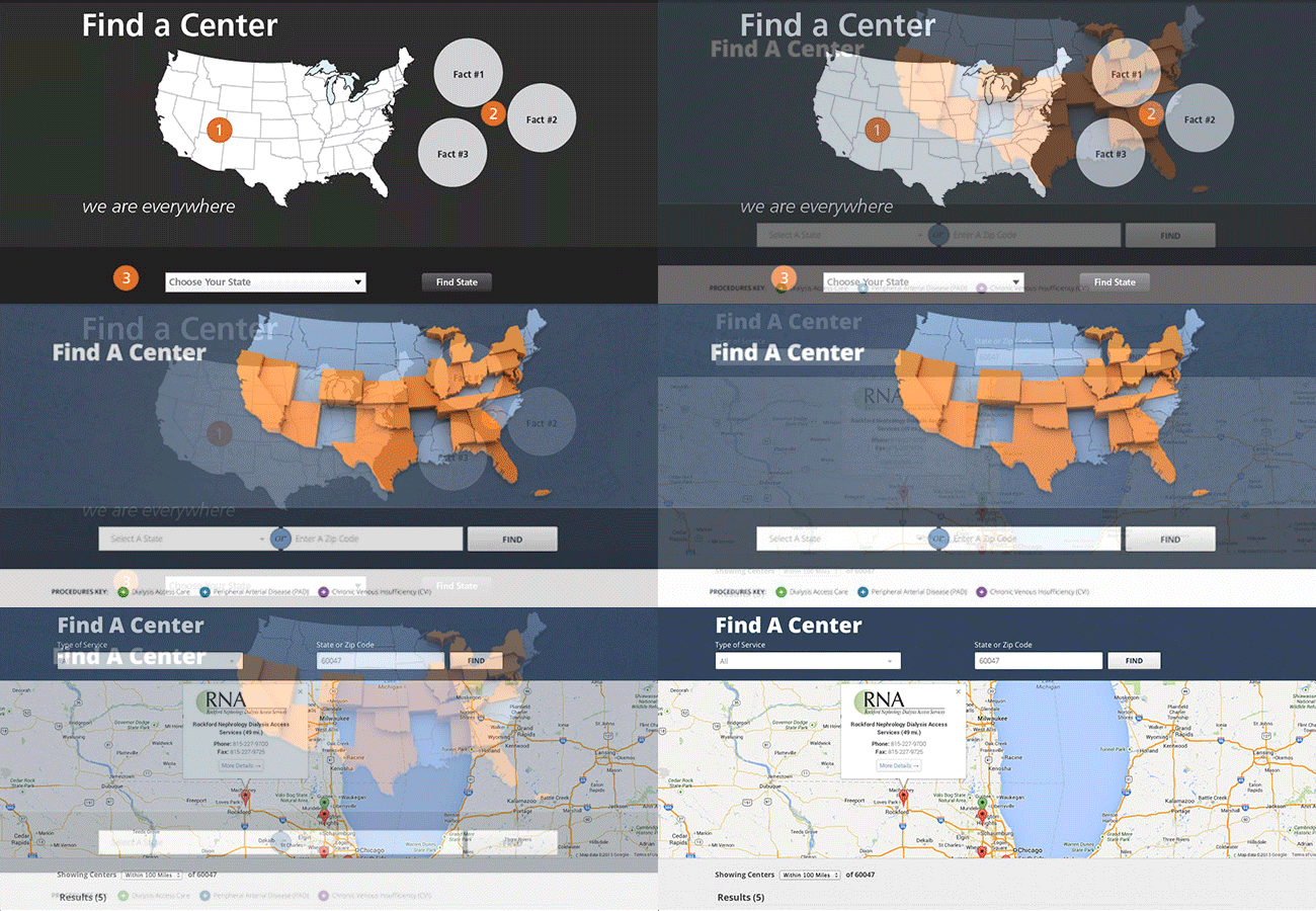
Keeping in constant communication with a client is also an excellent way to develop new ideas. However, this also means that you have to be agile in development and be able to cater to the new ideas that are exchanged. A great example of this is the Find a Center Page, which originally started as a state-by-state search. However, it eventually developed into a full out zip code search. And finally ended up as the final product you see today.

 This also happened on a larger scale not once, but twice with the addition of the Secure and Marketplace sections of the site. The challenge lied in finding a way to not only integrate these sites into the platform, but also to brand them all in a similar way. Luckily, Lifeline had brand standards in place, so we just had to take the time to explore other options that would compliment the brand, and come up with a strategic design to meet these added goals.
The first addition to the site was the Secure Login section. This section was fairly straightforward in that it would serve as a large archive of files and educational materials for Lifeline physicians and staff to access at their discretion. Rather than go for a flashy approach, we opted for an easy and clear organization, relying on strong headers, file names, and file labels to properly organize and store all data. This idea was soon followed up with the addition of an e-commerce marketplace for Lifeline employees to buy branded products for promotional and personal use. Though not a true ecommerce platform in the sense of the word (there is not a direct check out system, it functions more as a catalogue), we still had to find a way to display and organize multiple products in a user-friendly way, while providing options for product purchases and inquiries.
These additions to the website would not have even come to fruition without these frequent discussions with the client. We made sure to work with them in order to find time to incorporate these additions into their finished product so that everything could roll out at once. It is our philosophy to stick with the client every step of the way, and make sure we do whatever we can, even if it means taking on more work to deliver a better end product.
 Being partners is more than just a term to show we are working together on a project. It shows a strong bond and commitment to doing whatever it takes, even after the final product is delivered, to enhance and strengthen the end product. Shortly after go-live, our group examined click-stream data as well as heatmapping software in order to pinpoint areas of improvement. This allowed us to gather real feedback based on actual user experiences, and make appropriate adjustments accordingly.